Render Colours: A Practical Guide to Choosing the Right Shade
Colour is the decision people spend the most time on, and also the one they most often get wrong by relying on a printed chart rather than a sample on their actual wall in Cornwall's light. Here's what we've learned from picking colours with customers across north Cornwall and Devon.
What through-coloured render is
Through-coloured render — whether silicone or monocouche — has pigment running all the way through the material, not painted on top. If the surface gets scratched, you see the same colour underneath, not grey. That's why there's no repainting programme with these systems, and why colour choice matters so much up front.
We use professional-grade silicone and monocouche systems from trusted British manufacturers. The principles in this guide apply to any through-coloured render system — the colour questions are the same regardless of which product range you choose.
The colour range
Most professional render systems offer several hundred standard colours, from whites and creams through to warm sands, terracottas, greys, charcoals, and some stronger statement colours. Our preferred suppliers offer around 200 standard options with the ability to colour-match if you want something specific. The colour is integral to the topcoat only; the basecoat is always a neutral grey or white.
The sheer number of options sounds helpful but can make the decision harder. The reality is that for most properties in Cornwall, the sensible range of choices is much narrower than hundreds of colours suggests. Context matters a lot — what looks striking in a brochure can look out of place against Cornish stone, slate roofs and a grey Atlantic sky.
Which colours work in Cornwall
For older cottages and period properties — pre-1919 stone and rubble builds, traditional Cornish terraces, farmhouses — the colours that work best are the warm off-whites, creams, and earthy sandstones. Names like Cornish Cream, Limestone, Sandstone, and Old White sit naturally against Cornish granite, slate roofs, and the local landscape. They look like they belong. These are also the safest choices for resale, because they're neutral enough not to put off buyers.
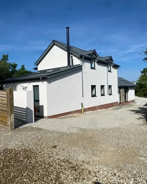
For modern builds, extensions, and contemporary renovations, sharper greys and charcoals look good. Mid grey, light grey, and anthracite are popular choices on modern self-builds and on agricultural conversion projects. They contrast well with dark timber cladding or aluminium windows, which is a popular combination on newer properties across Cornwall and Devon.
What tends to look wrong: bright whites that look stark against the muted Cornish landscape, warm ochres or terracottas that don't match the local palette, and very saturated colours that draw the eye in a way that can clash with the neighbourhood. These might work on an isolated rural property as a deliberate statement, but on a village terrace or a coastal town they often look out of place.
Coastal and colour: what to consider
On coastal properties, the colour choice interacts with the maintenance cycle. Lighter colours — whites and creams — show algae and biological growth more prominently than mid tones. If you're on a north-facing coastal wall that stays damp and shaded, algae will grow on any render over time, but on a bright white wall it's very visible. A warm cream or a light grey shows it less.
Darker colours like charcoal and anthracite tend to show salt haze more than lighter shades, particularly on very exposed coastal walls. After a sustained onshore gale, you can sometimes see a whitish salt deposit on dark render. It washes off in the next rain, but it's worth knowing about. On most Bude and Widemouth properties we'd lean toward mid-tones on the most exposed elevations.
How render colours age over time
Through-coloured render doesn't fade the way paint fades, but colours do change gradually over 15 to 20 years, particularly on south-facing walls that get a lot of UV. The silicone topcoats are UV-stabilised, but strong reds, yellows, and highly saturated colours will shift more than neutral tones over that timescale. Whites can yellow slightly over decades. Warm creams tend to stay closest to their original shade over time.
This matters if you're rendering one wall of a property that already has render on the other three sides. Even if you match the colour exactly at the time of application, the existing render has already aged and the new section will look different until it catches up. On full property rerenders this isn't a problem, but on partial works it's something to discuss with the customer upfront.
Always order a sample board
We always recommend ordering a sample board before committing to a colour. A printed chart is photographed under controlled studio conditions and printed on paper — neither of which matches a real wall in Cornwall's light. The same render colour can look quite different on an overcast February day than it did on the chart viewed under indoor lighting.
Sample boards are typically small sections of the render system applied onto a backing board. You can hold them against the wall, look at them in the actual light conditions, look at them wet (because that's what they'll look like after rain), and look at them at different times of day. It takes a week or two to get the sample, but it's much less painful than hating a colour you've just had applied across your whole house.
If you're torn between two colours, order both samples. The cost is minimal and the comparison on the actual building almost always makes the decision obvious.
Our recommendations
Period & Cottage Properties
- Cornish Cream / Old White
- Limestone / Sandstone
- Warm Off-White
- Light Stone
- Avoid: bright white, strong ochres
Modern & Contemporary Builds
- Mid Grey / Silver Grey
- Anthracite / Charcoal
- Light Grey
- Warm White
- Avoid: highly saturated tones
The premium silicone systems we use most often cover all the colour families above well. On any job where the colour decision is uncertain, we'll order sample boards and let the customer compare on their actual wall before we commit.
Our honest verdict
Colour choice matters more than people think when they first start looking at charts. The safest choices for Cornwall are the warm neutrals — creams, off-whites, and sandstones on traditional properties; greys and charcoals on modern builds. Both look right in the landscape and both are safe for resale.
The single most useful thing you can do is get a sample board on the wall and look at it in Cornwall's real light before you decide. It sounds like an obvious step and a lot of people skip it. The ones who skip it are usually the ones who end up asking whether the colour can be changed.
Got a job in mind?
Call us on 07761 735022 or message on WhatsApp.
Related articles
Written by the PureRend team — plastering and rendering specialist in Bude, Cornwall.